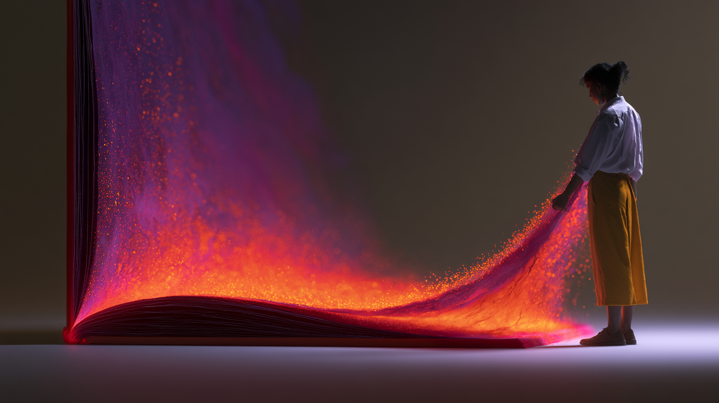
Sophisticated motion design creates emphasis without overwhelming the message.
Let’s be honest: a lot of brand motion is just nervous energy with a budget.
Things slide in because someone felt the frame was too empty. Logos spin because “static felt flat.” Headlines bounce because apparently we’ve all agreed that attention must be physically shaken out of people now. The result is work that feels busy, insecure, and weirdly desperate. Not premium. Not clear. Not memorable. Just… moving.
I like motion. I use it constantly. But motion is one of the easiest ways to make a good brand suddenly feel cheap. It only takes a few overly eager transitions, one smug little parallax moment, or some hyperactive hover behavior and the whole thing starts feeling like it’s trying too hard.
The real job of motion isn’t to decorate. It’s to direct. It should tell people where to look, what matters, what changed, and what to feel. That’s it. If your motion isn’t doing one of those things, it’s probably visual fidgeting.
Motion should create hierarchy, not commotion
The biggest misunderstanding in motion design is treating it like added value by default. Movement is not automatically useful. In fact, movement has a cost. The second something moves, the eye goes to it. That means every animated element is making a demand.
If everything is animated, nothing is prioritized. You don’t get energy. You get traffic.
Strong motion creates hierarchy the same way good typography does. It tells the viewer what enters first, what deserves focus, and what can stay quiet. A sharp motion system has restraint built into it. The most important thing moves first or moves differently. Secondary elements support. Tertiary elements stay still unless there’s a reason.
This is where a lot of brand work falls apart. Designers animate every card, icon, line, button, and product render with equal enthusiasm. It feels democratic, but branding is not a democracy. Some messages matter more than others. Motion should reflect that.
A simple rule I come back to: if an element isn’t earning attention in the concept, it shouldn’t be trying to steal it in the execution.
Speed is tone, not just timing
People talk about duration like it’s a technical setting. It’s not. It’s brand language.
Fast motion can feel precise, modern, confident. It can also feel nervous, flimsy, and disposable. Slow motion can feel elegant, premium, and controlled. It can also feel sleepy and self-important. The point is: timing isn’t neutral.
If your brand is meant to feel intelligent and composed, then your motion can’t act like it had three espressos. If your brand is meant to feel energetic and youthful, don’t make everything drift in like a luxury skincare ad.
The wrong timing is one of the fastest ways to break brand coherence. I’ve seen beautiful identity systems ruined by motion that felt completely unrelated to the tone of the visual design. Clean typography, strong grid, mature palette — and then the assets whip around like a sports betting app.
Pick a pace that matches the brand’s personality, then stick to it. Build consistency across transitions, reveals, UI interactions, social assets, and campaign work. A brand starts feeling premium when its motion choices feel intentional instead of improvised.
My bias: most brands need to slow down slightly and remove about 20% of their animation. Not because slower is always better, but because “a little less” usually reads as “a lot more confident.”
Ease curves matter more than people admit
This is where a lot of motion either feels polished or painfully generic. You can have the right idea, the right duration, even the right sequence — and it will still feel off because the easing is lazy.
Default easing is the enemy of distinctiveness.
Too many motion systems rely on software presets that were never designed to express a brand. They were designed to get something moving with minimal effort. That’s fine for prototyping. It’s not fine for finished creative.
How something starts and stops tells people whether it feels mechanical, natural, abrupt, soft, premium, playful, or rigid. Sharp ease-outs can create precision. Smoother ramps can create elegance. Minimal overshoot can add life. Too much overshoot makes everything feel like a toy.
This is subtle stuff, but subtle is where good branding lives. Nobody says, “Wow, incredible cubic-bezier choice.” They just feel the difference. One version feels expensive. One feels like a template.
If you want motion to feel sophisticated, obsess less over gimmicks and more over behavior. How does it enter? How does it settle? Does it stop with confidence or does it wobble into place like it’s asking for approval?
Use motion to clarify change
The most valuable thing motion can do is explain state change. This is especially true in digital brand experiences, product marketing, and interfaces. Movement helps users understand what just happened. What expanded. What collapsed. What updated. What moved forward. What requires action.
That’s where motion stops being decorative and starts being genuinely useful.
If a menu opens, the animation should reinforce where it came from. If content changes, the transition should preserve orientation. If a product feature is being highlighted, motion should focus the story, not compete with it. When motion clarifies logic, people experience the brand as thoughtful. When motion obscures logic, people experience it as friction.
A common mistake is using flashy motion where simple continuity would do the job better. Not every transition needs to announce itself. Sometimes the most effective move is the one people barely notice because it makes perfect sense.
Good motion reduces cognitive load. Bad motion adds theater to basic communication and then acts proud of itself.
One strong gesture beats five clever tricks
If you want a brand to have a recognizable motion signature, don’t build a grab bag. Build a principle.
The best motion systems usually have one or two defining behaviors that repeat consistently: a certain way elements reveal, a distinctive sense of acceleration, a particular relationship between scale and opacity, a disciplined use of direction. That consistency creates identity.
What doesn’t create identity is throwing in every cool thing you know how to do. Split text here, blur reveal there, elastic hover on buttons, floating layers, kinetic typography, scroll-triggered masks, looping gradients. That’s not a system. That’s a mood board having a meltdown.
Brand motion gets stronger when it’s reduced to a few recognizable moves. Think less “what else can we animate?” and more “what behavior belongs to this brand?”
A useful test: if you stripped out the logo and color palette, would the motion still feel like the same company? If not, the motion probably isn’t doing any brand work. It’s just occupying space.
Stillness is part of the system
This is the part motion designers sometimes hate hearing: not everything should move.
Stillness is what gives motion its power. Without contrast, movement loses meaning. If the whole environment is active, the brand feels restless. And restlessness is rarely the feeling you want unless you are literally marketing chaos.
Luxury brands understand this. Editorial brands often understand this. Tech brands, startup brands, and “innovation” brands are often terrible at this because they confuse motion with momentum. They think if the screen is alive, the brand feels advanced. Usually it just feels overstimulated.
Let some things hold. Let copy land. Let product imagery breathe. Let the user have one second without being nudged, floated, shimmered, or transitioned into submission.
Quiet is not boring. Quiet is what makes emphasis possible.
Practical rules I use to keep motion from getting obnoxious
Here are a few standards I come back to when reviewing creative:
Animate with purpose. If you can’t explain what the motion is doing for communication, cut it.
Prioritize one focal point at a time. Don’t make multiple elements compete in the same beat.
Keep brand timing consistent. A scattered mix of snappy, floaty, bouncy, and cinematic transitions feels amateur fast.
Avoid novelty as a strategy. A surprising effect is not the same thing as a meaningful one.
Design for repeat exposure. Motion that is mildly charming once can become deeply irritating by the tenth view.
Test with sound off and distractions on. If the motion still guides attention clearly, it’s doing real work.
Remove at least one-third of what you originally animated. I’m not joking. The first pass is usually proving you can do it. The second pass is deciding whether you should.
The brand should feel more sure of itself after motion, not less
That’s really the standard.
When motion is working, the brand feels more articulate. More deliberate. More confident. You feel that someone made decisions. You feel control. The message sharpens. The experience gets easier to follow. The emotional tone gets stronger without becoming louder.
When motion is bad, the opposite happens. The brand feels insecure, like it’s jingling keys to keep your attention. It feels covered up instead of clarified.
I’m not against expressive movement. I’m against empty movement. There’s a difference. Motion can absolutely be bold, stylish, emotional, even surprising. But it has to come from a point of view. It has to support the message. It has to know when to stop.
That’s the part people skip. They focus on getting things to move and forget to ask what kind of presence that movement creates.
And presence is the whole game.