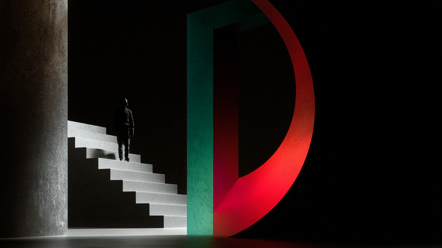
Reposition your dental practice as a modern, health-conscious oasis using elevated palettes and clean typography.
Most dental branding still looks like it was designed to either scare children or reassure insurance providers. You know the look: harsh blues, generic tooth icons, smiling stock models, and that strange clinical emptiness that says, “Please relax,” while visually doing the exact opposite. It’s a category problem, not just a design problem. Dentistry has spent decades branding itself like a necessary inconvenience. Then everyone wonders why patients show up tense, skeptical, and ready to cancel.
I think that’s a huge miss. A dental practice is not just a medical service. It’s a trust business. It’s a sensory business. It’s a before-and-after business. And in a culture that increasingly links oral health to wellness, confidence, longevity, and self-respect, the visual identity should evolve with that reality. If your brand still feels like a fluorescent waiting room, you’re underselling the experience before anyone even books.
Good design can’t eliminate fear entirely, but it absolutely can lower the emotional temperature. It can replace dread with clarity, suspicion with confidence, and sterile coldness with a feeling of premium care. That shift starts long before the first appointment. It starts with what people see.
Stop Branding the Practice Like a Medical Warning Label
There’s a difference between signaling professionalism and broadcasting anxiety. Too many dental identities lean on visual cues that feel severe, overly clinical, or embarrassingly literal. A giant tooth in the logo is rarely helping. Hyper-bright cyan paired with white doesn’t read “clean” anymore. It often reads “cheap healthcare flyer.” And if the typography looks like it came from a default software menu in 2009, patients notice, even if they can’t articulate why.
The real issue is that many practices mistake familiarity for trust. They copy the visual language of other dentists because it feels safe. But when every competitor uses the same palette, the same icon system, and the same bland promise of “gentle care,” nobody stands out and nobody feels especially believable. Category clichés don’t build comfort. They create wallpaper.
A calmer, more premium identity works because it treats patients like emotionally intelligent adults. It acknowledges that many people arrive with baggage: fear, shame, sensory sensitivity, budget concerns, embarrassment about how long it’s been. Your brand should not add noise to that. It should communicate: this place is thoughtful, modern, competent, and in control.
Calm Does Not Mean Boring
There’s a lazy version of “calm” branding that strips out all character and leaves you with beige mush. That’s not what I’m talking about. Calm should feel intentional, not sedated. Premium should feel grounded, not snobbish. The sweet spot is restraint with personality.
Color does a lot of the heavy lifting here. If you want to reposition a dental practice as a modern health-conscious destination, move beyond the default clinic blues. There’s nothing inherently wrong with blue, but most practices use the worst possible version of it: synthetic, cold, and high-contrast. Better options live in more nuanced territory. Soft mineral tones, warm whites, muted sage, stone, clay, fog, charcoal, eucalyptus, even restrained sand tones can create a sense of cleanliness without shouting “disinfectant.”
The point is not to make the brand look like a boutique hotel or skincare line for the sake of trendiness. The point is to borrow from categories that already understand how to create reassurance through atmosphere. Wellness brands, premium hospitality, and high-end lifestyle healthcare often do this better than traditional dentistry. They know that emotional ease comes from balance, texture, and visual confidence.
If the palette feels elevated, patients begin to assume the care is elevated too. That’s not manipulation. That’s how perception works. People make quality judgments instantly, and your visual identity is either making your expertise feel more credible or quietly undermining it.
Typography Is Where Trust Gets Real
If I had to pick the most underrated part of dental branding, it would be typography. Everyone obsesses over logos. Meanwhile, the actual day-to-day patient experience of the brand is mostly type: website headlines, treatment pages, forms, signage, appointment reminders, post-care instructions, packaging, wayfinding. If the typography is messy, generic, or dated, the entire practice feels less organized.
Clean typography does more than look polished. It reduces cognitive friction. That matters in a category where people are already stressed. A good type system can make information easier to process, make the practice appear more composed, and communicate a level of care that extends beyond the chair.
I strongly prefer type choices that feel contemporary but not trendy. Nothing overly decorative. Nothing so geometric it becomes cold. Nothing overly “friendly” that slips into childishness. You want clarity with elegance. A refined sans serif paired with a subtle, intelligent secondary face can go a long way. Done right, typography tells patients that this practice has standards.
It also helps reposition the practice away from the old model of dentistry as grim necessity. Strong typography says: we are current, we are measured, we are design-aware, and we understand that presentation is part of patient care. That’s especially important if your services include cosmetic dentistry, implants, whitening, Invisalign, or any treatment tied to confidence and self-image. The brand should visually support that premium expectation.
The Waiting Room Starts Online Now
Most patients encounter your brand on a screen before they ever encounter your space. So if your website feels cluttered, your Instagram looks inconsistent, and your online booking journey feels like an administrative obstacle course, your expensive office renovation isn’t doing enough heavy lifting.
The digital brand experience should feel as calm and intentional as the physical one. That means fewer frantic calls to action, fewer stock photos of fake laughter, and fewer blocks of copy trying to over-explain your humanity. Show, don’t announce. Use real photography with soft, believable lighting. Feature your space if it actually looks good. Use close-up details carefully. Materials, textures, team presence, and small gestures of comfort often say more than another paragraph about “patient-centered care.”
Navigation matters too. A premium-feeling practice should have a website that is easy to move through, easy to read, and easy to trust. Treatment pages should feel clear, not salesy. Pricing information, if you share it, should be framed with confidence. Forms should be simple. Mobile experience should be excellent. If a nervous patient has to fight your interface just to request an appointment, that’s already a bad first impression.
Designing for calm online means reducing uncertainty. Uncertainty is what spikes anxiety. Good branding can’t erase a fear of drills, but it can eliminate a lot of pre-appointment stress by making everything feel coherent, transparent, and cared for.
Premium Is About Precision, Not Pretension
A lot of practices hear the word “premium” and immediately overdo it. Suddenly everything is black, gold, and absurdly luxurious, as if the clinic is trying to sell champagne instead of preventive care. That’s not the move. Premium in healthcare should feel disciplined. It should suggest better standards, better experience, better communication, and more thoughtful details.
In branding terms, that usually means tighter art direction, better materials, smarter spacing, more intentional photography, and a consistent system across every touchpoint. Business cards, appointment cards, signage, emails, social graphics, product packaging, uniforms, and interior graphics should all feel like they belong to the same world. Consistency is calming because it signals competence.
Patients may not consciously say, “I appreciate the disciplined use of typography and negative space.” But they do feel when a brand is coherent. They feel when a place seems orderly and considered. And in dentistry, order reads as safety.
That’s why the little things matter more than people admit. The softness of the language on a reminder text. The readability of a treatment plan document. The absence of visual clutter in the lobby. The tone of the photography. The quality of the signage. This is all brand. And in a fear-heavy category, brand is not cosmetic. It is emotional infrastructure.
What to Change First If Your Brand Feels Dated
If your current identity feels stuck in the old dental playbook, don’t panic and don’t start by redesigning the logo in isolation. That’s how people waste money. Start with the bigger system.
First, audit your color palette. Ask whether it genuinely feels calming and modern, or just default-clinical. If it looks like every other office in your ZIP code, it’s probably working against you.
Second, fix the typography. This is often the fastest way to make a practice feel more premium without becoming theatrical. Cleaner type hierarchy, better spacing, and more considered font choices can transform everything from the website to internal documents.
Third, upgrade the photography. Real, art-directed imagery beats generic stock every single time. Patients can smell stock photography from a mile away. It immediately creates emotional distance.
Fourth, simplify your messaging. Most dental brands say too much and say it in the most forgettable way possible. Lead with clarity. Be specific. Sound like confident humans, not a stitched-together compliance brochure.
Finally, look at the full patient journey. If the visual identity says “calm, premium care” but the emails are chaotic and the intake process feels bureaucratic, the illusion collapses. Brand only works when the experience backs it up.
Design Should Lower the Pulse
This is my basic take: dental branding has been visually tone-deaf for too long. It keeps repeating a cold clinical language in a category where fear is one of the biggest barriers to engagement. That’s not neutral. That’s bad strategy.
A better visual identity doesn’t need to become soft for the sake of softness. It needs to become more emotionally intelligent. More restrained. More elegant. More precise. More aware of what patients actually bring with them when they walk through the door.
When a dental practice looks calm, modern, and premium, it sends a powerful signal: this place has thought about the experience. That matters. People don’t just want clean teeth. They want to feel safe, respected, and in good hands. Design can start creating that feeling long before treatment begins.
And honestly, that’s the opportunity. Not just to look better than the competition, but to behave like a different category entirely.