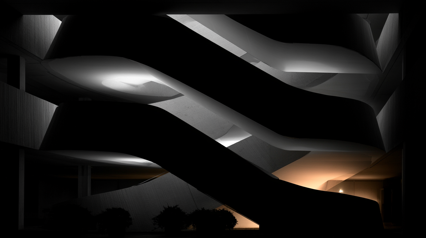
Learn the architectural photography standards and editorial layouts needed to capture eight-figure listings.
Eight-figure listings have a branding problem, and most of it is self-inflicted. The property might be extraordinary. The land might be irreplaceable. The interiors might have been touched by architects, artisans, and designers with serious pedigree. Then someone throws it into the market with flat lighting, generic wide-angle photography, and a brochure layout that looks like a template for a mid-tier condo development from 2017. That gap between product and presentation is where value leaks.
I have a strong opinion about this: luxury is not just about price. It is about visual discipline. If a brokerage wants to represent a high-end property well, the marketing creative has to act like it belongs in the same room as the home itself. Not louder than the property. Not more “creative” for the sake of awards. Just more precise, more editorial, more assured. Expensive things rarely need to shout. But they absolutely cannot look cheap.
Luxury buyers read images before they read copy
People love to say that affluent buyers care about lifestyle, discretion, and story. True. But before any of that lands, the images have already made the case or killed it. Visual storytelling is the first showing now. It sets the emotional ceiling for how the property is perceived, how the brokerage is perceived, and frankly how credible the asking price feels.
MLS-grade visuals fail because they are built around coverage instead of curation. They aim to prove every room exists. That’s fine for commodity inventory. It’s a disaster for a property trying to communicate rarity. High-end homes need a point of view. The goal is not “show everything.” The goal is “show the right things in the right order so desire builds naturally.”
That means less visual clutter, fewer redundant angles, and a much stronger sense of pacing. A great luxury listing presentation should feel like an editorial feature, not an evidence packet. Buyers at this level are not just evaluating square footage. They are evaluating taste, social signaling, architectural legitimacy, and whether the entire package feels worthy of their attention.
Architectural photography is not real estate photography with better gear
This is where a lot of brokerages get lazy. They hire a shooter who can produce clean listing photos, then wonder why the campaign lacks gravity. Architectural photography is a different discipline. It is slower, more deliberate, and much less forgiving. It respects line, material, negative space, and natural light. It is about authorship, not documentation.
The first standard is composition. Parallel verticals are not optional. Distortion screams amateur, especially in homes where the architecture is the main event. If the walls look like they are collapsing backward, the image is working against the listing. Wide-angle abuse is another dead giveaway. If the room only looks impressive at 16mm, the problem is not the room. The problem is the approach. Luxury photography usually feels more restrained because restraint reads as confidence.
The second standard is lighting. Flash-heavy interiors often kill mood, flatten texture, and make premium finishes look synthetic. Stone should feel tactile. Wood should feel warm. Metal should have dimensionality, not glare. Natural light, controlled supplementary light, and patient timing matter more than brute-force brightness. Twilight has its place, but it has also been overused into cliché. Not every high-end property needs the same blue-hour hero shot. Some homes are morning houses. Some are all about shadow. Some are best when the landscape is breathing at dusk. The point is to interpret the property, not apply a formula.
The third standard is styling. Minimal does not mean empty, and luxury does not mean over-accessorized. Every object in the frame is making an argument about the buyer. Bad styling creates noise. Good styling creates aspiration with enough restraint that the space still leads. Fluffed pillows and random bowls of lemons are not a strategy. If the property has pedigree, let that pedigree speak.
The last standard is sequencing. Hero images need to earn their place. Start with the image that captures identity, not just scale. That might be the exterior approach, a sculptural stair, a double-height living room, or an impossible view line from interior to landscape. Think like a magazine editor: what’s the cover, what’s the opening spread, what’s the detail shot that proves quality, what’s the final image that lingers?
Editorial layouts are where luxury gets translated into brand value
Photography alone does not create premium positioning. The layout does a massive amount of work, and most brokerages underestimate it. A weak brochure or landing page can make excellent imagery feel generic in seconds. If the design looks crowded, over-labeled, or salesy, the listing loses altitude immediately.
Editorial layout works because it introduces hierarchy. It tells the viewer what matters and what can wait. It gives premium imagery room to breathe. White space is not wasted space. In luxury marketing, white space is often the thing signaling confidence. Cheap design tries to fill every inch. Expensive design edits hard.
I prefer layouts that borrow from architecture, fashion, and shelter magazines more than traditional real estate collateral. Full-bleed imagery for impact. Quiet typography. Tight captioning, if any. A grid system that feels invisible because it is so well controlled. Materials, provenance, and design details should appear where they support the narrative, not in giant bullet blocks that interrupt momentum.
There is also a sequencing principle that matters a lot: alternate scale with intimacy. Big establishing image, then a tighter material moment. Vast exterior, then a detail of bronze hardware or veined marble. That rhythm keeps the viewing experience from becoming monotonous and helps the property feel layered rather than merely large. Big is not enough. Wealthy buyers have seen big before. They notice finish, specificity, and taste.
And for the love of all things expensive, stop cramming every amenity into icon rows and feature explosions on the first page. A wine cellar, wellness suite, private dock, screening room, or guest pavilion should be revealed with composure. Luxury is often communicated through withholding, timing, and confidence. If everything screams at once, nothing feels special.
The visual story should sell a world, not a checklist
The biggest creative mistake in this category is reducing the property to features. Features matter, obviously. But features do not create emotional charge on their own. A good luxury campaign builds a world around the home. It suggests a tempo of living. It creates a social and sensory frame that lets the right buyer imagine themselves inside it without forcing the fantasy too hard.
This is where ancillary visuals can help if they are handled with taste. A restrained set of lifestyle images can add atmosphere. Landscape details, the quality of light through linen drapery, the geometry of a pool edge against the horizon, the arrival sequence through a gate or motor court. These details build narrative texture. They tell the buyer this is not just another expensive house. It is an environment with its own rules and its own point of view.
Copy should support that feeling, not compete with it. The best writing in luxury listings is sparse and selective. It does not over-explain. It names what matters: architect, materiality, provenance, site, orientation, privacy, craftsmanship. It avoids the exhausted vocabulary of “stunning,” “nestled,” and “one-of-a-kind” unless there is actual substance behind the claim. High-end audiences are very good at detecting inflated language. Calm specificity wins.
Production quality is now part of the brokerage’s own positioning
One overlooked reality: premium listing creative does not only market the home. It markets the brokerage to future sellers. Every campaign becomes a business development asset. If your visual standards are exceptional, owners of serious properties notice. If your materials feel generic, they notice that too.
This is why consistency matters. One spectacular property microsite surrounded by average listing presentations is not a luxury brand system. It is a one-off. Brokerages that truly own this space build standards. They know their photography brief. They know their retouching threshold. They know their typography, pacing, print specs, paper stock, site motion behavior, and how video integrates without turning the whole thing into a cinematic parody.
And yes, print still matters here. Not for mass distribution. For signaling. A beautifully produced printed piece, handled with restraint, can do something digital often cannot: it slows the experience down and gives the property physical presence. If the home is exceptional enough, the collateral should feel collectible, not disposable.
What to fix immediately if your luxury listings still feel ordinary
First, audit your image selection. Remove redundant room coverage and any shot that exists only because someone thought “we should probably include it.” If it does not deepen desire or understanding, cut it.
Second, stop treating every listing with the same template. High-end properties need art direction. Build a narrative sequence around the architecture, site, and buyer profile.
Third, invest in specialists. Not just better photographers, but photographers who understand architecture. Not just designers, but designers who understand editorial hierarchy and premium restraint.
Fourth, simplify your layouts. More white space. Fewer callouts. Better type. Better pacing. Less neediness.
Finally, get comfortable with editing. Most luxury marketing improves when 20 percent of the content is removed and the remaining 80 percent is elevated.
That’s the real standard. Eight-figure listings should look composed, intentional, and unmistakably premium before anyone reads the price. If the visuals are doing their job, the property feels expensive on sight. And if they aren’t, the market notices long before the brokerage does.