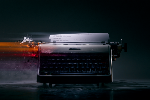
Understand why letting premium photography and bold composition do the heavy lifting commands real authority.
Your ad copy isn’t weak because it says too little. Most of the time, it’s weak because it refuses to stop talking. Brands love to act like every square inch of an ad is a hostage situation where ten more words might save the sale. They cram in proof points, taglines, disclaimers, emotional hooks, and a weird little paragraph that sounds like it was written by a committee trying not to offend anyone. Then they wonder why the ad feels cheap.
Here’s the uncomfortable truth: cluttered copy usually signals fear. Fear that the product won’t speak for itself. Fear that the audience won’t “get it.” Fear that if marketing doesn’t explain everything, nobody will buy. But premium brands, strong campaigns, and visually confident creative all understand the same thing: if the image is doing its job, the copy’s job gets smaller.
That’s not laziness. That’s discipline.
Too Much Copy Kills Authority
If you want an ad to feel premium, stop over-explaining it. Real authority rarely sounds desperate. It doesn’t beg for attention with a wall of text. It doesn’t shout every feature into the room. It doesn’t perform anxiety.
When an ad is overloaded with language, the brand starts looking like it doesn’t trust its own visual identity. The message becomes, “Please read all of this so you understand why we matter.” That’s not confidence. That’s compensation.
Minimal text, on the other hand, creates tension in a good way. It says: this visual matters, this product matters, this brand expects to be taken seriously. It gives the audience room to interpret, react, and feel something before being force-fed a paragraph of strategy disguised as copy.
People don’t experience visual advertising like they’re studying for an exam. They scan. They absorb. They decide fast. Strong composition, premium photography, and a sharp line of copy can communicate more in two seconds than a bloated block of text can communicate in twenty.
And if your response to that is, “But our customer needs more information,” fine. Put the information on the landing page, product detail page, email follow-up, or literally anywhere else built for depth. The ad is not a brochure. Its job is to create desire, recognition, intrigue, and momentum.
Visuals Work Harder When Copy Gets Out of the Way
The best ads often feel obvious in hindsight. A striking image. A clean frame. One thought. No clutter. No tug-of-war between the art direction and a paragraph trying to explain what the viewer should already feel.
Good photography carries status. Great composition creates hierarchy before a word is ever read. Light, color, framing, styling, contrast, and pacing all communicate brand value. That’s why a visually excellent ad can feel expensive even before the audience knows the price point. People are reading cues constantly, and most of those cues are not verbal.
When you bury a premium visual under too much copy, you flatten its impact. You turn an ad into a layout problem. Suddenly the viewer is negotiating where to look instead of being pulled somewhere intentionally. Instead of landing on the product or the emotional core of the image, their eye starts skipping around like they’re hunting for the point.
That’s usually where engagement drops. Not because the idea was weak, but because the execution couldn’t resist adding “just one more thing.”
A visual-first ad gives the eye a clear path. See the image. Feel the tone. Catch the line. Understand the action. Done. That flow matters more than marketers like to admit.
Why More Words Usually Mean a Weaker Idea
I’ve sat in enough reviews to know the pattern. The original creative concept is clean. The image has power. The line is sharp. Then feedback rolls in.
Can we mention the offer?
Can we include the sustainability angle?
Can we call out the feature difference?
Can we make the CTA more direct?
Can we add a support point in case the headline feels too vague?
Bit by bit, the ad gets “improved” into submission.
Most over-copying happens because nobody wants to make a hard choice. But strong creative is made of hard choices. It chooses one message, not five. It prioritizes one reaction, not every possible reaction. It decides what matters most and lets the rest wait.
If your ad needs six supporting statements to make the main idea work, the main idea probably isn’t strong enough. Or worse, nobody agreed on what the ad is actually supposed to do, so now the copy is trying to satisfy brand, product, legal, sales, performance, and executive opinion all at once. That’s how you end up with creative that technically says everything and emotionally says nothing.
Minimal copy forces strategic honesty. What is the one thing this ad must communicate? What can the visual handle on its own? What is genuinely important, and what is just internal nervousness showing up in text form?
Practical Ways to De-Clutter Your Copy
This is where teams usually nod in agreement and then go right back to writing too much. So here’s the practical part.
First, write the long version. Get every message out of your system. Then cut it brutally. Not politely. Brutally. If a line doesn’t sharpen the idea, remove it. If it repeats what the image already says, remove it. If it sounds like generic brand filler, definitely remove it.
Second, separate what belongs in the ad from what belongs after the click. Ads create attention. Landing pages resolve questions. Those are different jobs. Stop making the ad carry the whole funnel on its back.
Third, test whether your visual can communicate without copy. Strip all the words off the layout and ask: is the tone clear? Is the focal point obvious? Does the image create curiosity, aspiration, appetite, tension, or relevance? If the answer is no, the solution might not be more copy. It might be better art direction.
Fourth, make your headline do one job. Not three. A strong headline can provoke, frame, or anchor. It does not need to explain the entire business model. Shorter is not automatically better, but sharper always is.
Fifth, stop treating subhead copy like a safety blanket. If you always need a subhead to explain the headline, your headline may be trying too hard to sound clever without actually being clear. Or your team may be too scared to let a simple line stand on its own.
Sixth, watch your typography. Minimal text only works if the remaining text has presence. Weak hierarchy, timid sizing, and cramped placement can make even a short message feel messy. Fewer words need more intention, not less.
Minimal Doesn’t Mean Empty
There’s a difference between restraint and underthinking. Cutting copy isn’t an excuse to produce vague, artsy nonsense and call it premium. Minimal works when the idea is precise and the visual language is doing real work. It fails when there’s no strategic backbone underneath the cleanliness.
An empty ad says very little and means even less. A disciplined ad says little because it has chosen carefully. That’s the distinction.
Some brands hear “use less copy” and interpret it as “remove all clarity.” Then they produce beautiful ads nobody understands. That’s not sophistication. That’s indulgence. Minimal creative still needs a point of view, a target, and a reason to exist.
The sweet spot is simple: one strong visual idea, one clear verbal idea, one intended reaction. That combination is hard to beat.
What This Looks Like in Real Marketing
If you’re selling luxury, less text almost always helps. Premium products need space around them. They need confidence in the frame. They need language that feels selective, not needy.
If you’re in lifestyle, fashion, beauty, hospitality, interiors, automotive, food, or high-end tech, the visual environment is half the sale. Maybe more. The audience is judging taste, not just utility. Every extra sentence competes with that judgment.
Even performance marketing can benefit from restraint. Not every conversion-focused ad needs to look like a coupon exploded on it. Clear offer structure matters, yes. So does visual trust. Clean creative often performs better because it feels more legitimate, more intentional, and less like it’s trying to trick somebody into clicking.
And internally, a cleaner copy approach has another benefit: it reveals whether the team actually believes in the work. If people keep stuffing extra lines into the ad, they may not trust the core concept. Better to confront that early than hide it under more text.
The Real Flex Is Restraint
Anybody can add more copy. That’s easy. Restraint is harder. Restraint requires taste, confidence, and a willingness to leave some space unfilled. It asks the brand to act like it belongs in the room instead of constantly introducing itself.
The strongest ads don’t look crowded with effort. They look inevitable. The visual lands, the message locks in, and the audience gets it fast. That’s not because the team said less for the sake of style. It’s because they knew exactly what mattered and had the nerve to stop there.
So if your ads feel noisy, cheap, or weirdly forgettable, don’t start by asking how to say more. Ask what you can remove. Ask whether your visual is being trusted enough. Ask whether your copy is clarifying the idea or suffocating it.
Because in marketing creative, silence is often the thing that makes the message louder.