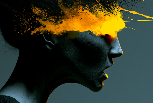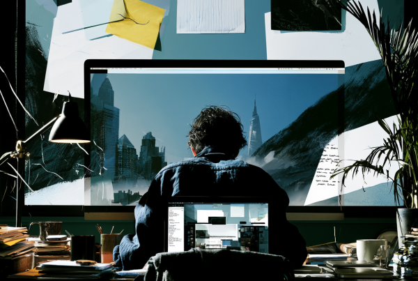
A disciplined motion system can earn attention without resorting to visual gimmicks.
Most brands are getting motion design wrong in exactly the same way: they treat movement like a sugar rush. More speed, more transitions, more flying type, more “energy.” Then they wonder why the work feels cheap, forgettable, or worse, annoying. The feed is already noisy. Throwing more noise into it is not a strategy. It’s panic disguised as creativity.
If your brand is trying to compete in crowded feeds, motion absolutely matters. But not because it lets you cram in more effects. It matters because motion can create hierarchy, clarity, rhythm, and recognition faster than static design alone. Used well, it helps people understand what they’re looking at before their thumb moves on. Used badly, it becomes the reason they leave.
I’ve seen too many teams confuse “animated” with “effective.” Those are not the same thing. The brands that consistently stand out are usually doing something far less theatrical and far more disciplined: they build a motion system. Not one cool reel. Not one trendy transition pack. A system. Something repeatable. Something recognizable. Something that serves the brand instead of performing for the designer.
Motion should create recognition, not just attention
Let’s start with the basic problem. Attention is not that hard to get for half a second. A weird jump cut, a sudden zoom, a hyperactive text animation, a burst of color—sure, people will notice it. But that doesn’t mean they’ll remember who it came from, what it meant, or why they should care.
This is where a lot of marketing creative falls apart. Teams optimize for interruption instead of recognition. They ask, “How do we stop the scroll?” when they should also be asking, “What happens after we stop it?” If the answer is visual chaos, you haven’t won anything.
A disciplined motion system gives your brand a repeatable language. Maybe your transitions always ease in a certain way. Maybe your typography reveals with restraint instead of exploding onto the screen. Maybe your product shots move with a certain confidence and pace. Maybe your UI demos have a specific rhythm that becomes familiar over time. That consistency is what turns motion into brand equity.
The best motion design doesn’t scream, “Look what I can do.” It says, “You know this is us before the logo even appears.” That is massively more valuable than a one-off flashy post that gets polite internal applause and disappears in 24 hours.
Most motion-heavy brand content is trying too hard
Here’s the blunt version: a lot of motion work in marketing is compensating for weak creative decisions upstream. The message is fuzzy, the design system is underdeveloped, the product story is generic, so motion gets asked to rescue it. That almost never ends well.
Movement can amplify a strong idea. It cannot fix a vague one.
When every element on screen is moving, none of it feels important. When every cut is dramatic, drama disappears. When every asset is treated like a trailer for a summer blockbuster, the brand starts to look insecure. And insecure brands are exhausting to watch.
I’m not against expressive motion. I’m against motion with no editorial judgment. There’s a difference. A good creative team knows when to hold, when to reveal, when to accelerate, and when to leave something still. Stillness is part of motion design. In fact, in a crowded feed, stillness is often the power move. It creates contrast. It creates tension. It tells the viewer that you’re in control.
That’s the real issue: control. Flashy motion often feels like the brand is flailing for relevance. Disciplined motion feels intentional. It gives the impression that the brand knows exactly what matters and isn’t afraid to focus on it.
What a real motion system actually includes
When people hear “motion system,” they sometimes imagine a bloated brand guideline deck no one will use. That’s not what I mean. A good motion system is practical. It should help creative teams make better decisions faster, especially when they’re producing a lot of content across channels.
At minimum, it should define a few things clearly.
First, pacing. How fast does your brand move? Is it crisp and efficient? Calm and premium? Playful and elastic? Speed is not neutral. It communicates personality immediately.
Second, transitions. How do scenes connect? Hard cuts, wipes, fades, scale shifts, directional moves—pick the ones that fit your brand and use them with discipline. Random transitions are one of the fastest ways to make content feel generic.
Third, typography behavior. How does text enter, exit, highlight, or build emphasis? If your static typography system is tight but your animated type behaves like it drank six energy drinks, the whole brand falls apart.
Fourth, spatial logic. Do elements move in ways that feel physically coherent? Do they respond to a grid? Do they align with the way your interface, packaging, product, or photography already works? Motion should extend the design system, not ignore it.
Fifth, emphasis rules. What gets motion and what stays still? This matters more than most teams realize. Motion is a hierarchy tool. If everything is emphasized, nothing is.
The point is not to reduce creativity. It’s to stop reinventing your visual behavior every single time you publish. Repetition is how brands become recognizable. Without that, you’re just producing content. With it, you’re building memory.
Practical ways to make motion work harder in the feed
If you want motion design to help your brand compete, start by being less impressed with effects and more interested in usefulness.
Lead with one clear move. Not five. Pick the single most important visual action in the first second and make sure it supports the idea. A product rotates into view. A key phrase builds with confidence. A before-and-after transformation is revealed. Give the eye a focal point.
Design for silent viewing. This should still be obvious by now, but somehow it’s not. Your motion needs to communicate without audio. That means stronger visual hierarchy, smarter caption behavior, and less dependence on voiceover to explain what the animation is doing.
Use rhythm, not chaos. Good feed motion has timing. It knows when to snap and when to breathe. Too many posts feel like every frame was animated independently by someone who never watched the whole thing back.
Protect readability. If your type is moving so much that it becomes work to read, you’re burning attention instead of earning it. The point of animated text is to improve communication, not turn copy into an obstacle course.
Build modularly. You do not need a custom cinematic treatment for every asset. Create reusable motion patterns for product callouts, testimonial frames, stat cards, feature reveals, and brand sign-offs. This saves time and creates consistency, which is the actual long game.
Test what people remember, not just what they watched. Views are a vanity metric if the work leaves no imprint. Ask whether people can identify the brand, recall the message, or recognize the style later. That’s a better measure of whether your motion system is doing its job.
The brands that win usually look more restrained, not less
This is the part people don’t like hearing because it sounds less exciting in a brainstorm: maturity looks restrained. The brands that feel expensive, confident, and culturally aware are rarely the ones throwing every motion trick at the screen. They edit harder. They simplify more. They trust the audience to follow.
That doesn’t mean boring. It means selective. It means they understand that motion is strongest when it has purpose. A subtle delay can create anticipation. A clean directional slide can imply momentum. A repeated text cadence can become a signature. None of that is loud. All of it is effective.
There’s also a production reality here. Disciplined systems scale. Gimmicks don’t. If your brand’s motion language depends on constantly chasing trends, your team will always be rebuilding from scratch, and the output will always feel inconsistent. A system lets you make high-volume creative without looking like you outsourced your identity to the algorithm.
And yes, trends matter. Ignore culture at your own risk. But trends should be filtered through brand logic, not pasted on top of it. The right question is not, “What motion style is popular right now?” It’s, “Which current behaviors can we adapt in a way that still feels unmistakably ours?”
Stop trying to entertain people with branding and start communicating with intent
Not every branded post needs to feel like content entertainment. That mindset has pushed a lot of marketing creative into a weird middle ground where it’s neither genuinely entertaining nor clearly informative. It just moves a lot.
Motion design is at its best when it sharpens communication. It should help explain a product faster, dramatize a benefit more clearly, frame a message more memorably, or reinforce a brand behavior consistently. That’s enough. Honestly, that’s more than enough.
If you’re a brand fighting for visibility in a crowded feed, the answer is not more visual caffeine. It’s better judgment. Build a motion system with rules, character, and restraint. Let movement support meaning. Let consistency build recognition. Let clarity do some of the heavy lifting for once.
Because flashy motion can steal a glance. Disciplined motion can build a brand.