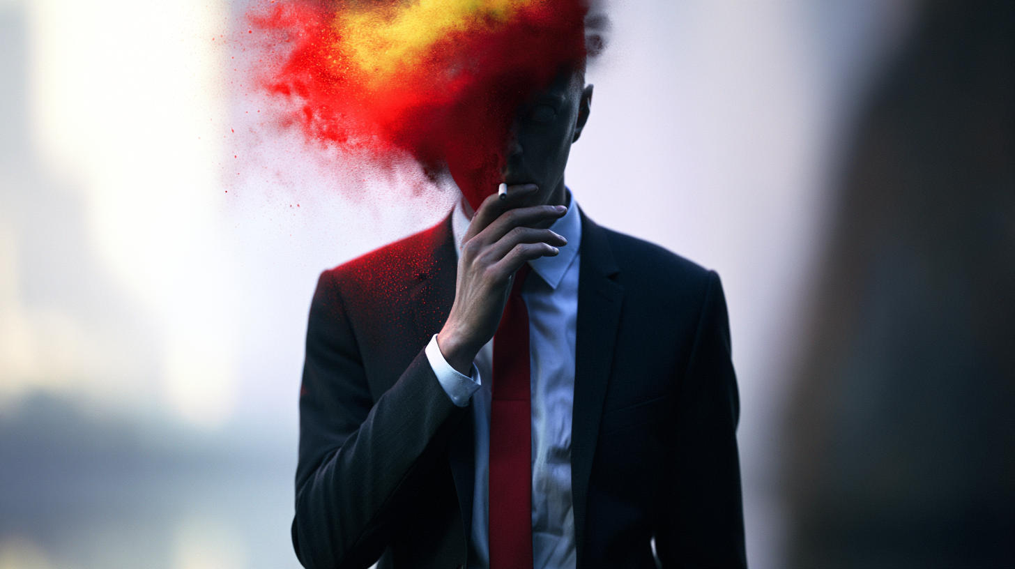
Paid social creative deserves the same strategic discipline as any other serious brand touchpoint.
Too many brands still treat paid social like the junk drawer of marketing. TV gets the polish. Brand campaigns get the thinking. The website gets the design system. Email gets optimized into the ground. Then social ads get whatever is left over: resized campaign assets, awkward product cutdowns, stale headlines, and a panicked request to “make it feel native.”
That’s backward.
For a lot of brands, paid social is not some side channel. It is the first impression. It is the brand handshake. It is the thing people see before they visit your site, before they hear your podcast ad, before they walk into your store, and definitely before they care about your “brand story.” If your paid social creative looks rushed, generic, or weirdly off-brand, people do not separate that from the rest of your company. They assume that is your company.
And honestly, they’re right to.
Most paid social creative fails at the brief, not the execution
People love blaming performance on the algorithm, the audience, the CPMs, the platform, the season, the economy, Mercury retrograde, whatever. But a lot of social ads are dead on arrival because they were built with no clear point of view. Not a bad design problem. A bad thinking problem.
The most common mistake is treating paid social as a production task instead of a creative assignment. “We need six statics and three videos by Friday” is not a brief. It’s a shopping list. If the team making the work does not know the audience tension, the emotional angle, the product truth, and the desired behavioral outcome, they are just decorating inventory.
Good paid social creative starts with the same questions you would ask for any serious campaign:
Who are we trying to move?
What do they currently believe?
What do they need to feel?
Why should they care right now?
What is the one thing we want remembered after the thumb keeps moving?
If those answers are fuzzy, the output will be fuzzy too. And fuzzy does not perform. Fuzzy gets ignored.
The ugly truth is that a lot of brands are afraid to be specific. Specificity means making choices. Making choices means excluding people, and corporate teams hate excluding people. So they write broad, cautious, sanded-down messaging designed to offend no one and excite absolutely nobody. Then they wonder why the ad with 14 benefits, 3 fonts, and a stock photo of a smiling woman holding a phone didn’t convert.
Social is not the place for leftovers
There’s a lazy habit in marketing where paid social becomes the final resting place for campaign scraps. A key visual from a bigger launch gets awkwardly cropped into vertical. A 30-second spot gets butchered into a six-second clip with no setup, no tension, and no payoff. Someone tosses on a CTA button and calls it “performance creative.”
That is not adaptation. That is disposal.
Social platforms have their own grammar. People process ads there differently. They move faster, judge faster, and abandon faster. The work has to earn attention immediately, but that does not mean screaming harder. It means being designed for the environment instead of merely shoved into it.
That requires intention. Native pacing. Clear focal points. Copy that sounds like a person wrote it. Hooks that create relevance in the first second. Product framing that lands even with the sound off. A structure that survives interruption. And yes, visual standards that still feel like the brand, not some bargain-bin impersonation of it.
I’ve seen brands spend millions building a premium perception, then run paid social ads that look like they were assembled in a rideshare on the way to the airport. And then leadership acts shocked when the campaign drives cheap clicks but low trust. Of course it does. People can feel the disconnect.
If your brand says “high quality” everywhere except the ad most people actually see, you do not have a media problem. You have a credibility problem.
The first three seconds matter, but not in the dumb way people say it
Everyone says the first three seconds matter. True. But the industry often interprets that to mean every ad needs an explosion, an oversized headline, a jump cut, a screaming color palette, and a person pointing at text like they just discovered fire. That’s not strategy. That’s insecurity.
The first three seconds are not about chaos. They’re about clarity.
The audience should instantly understand one of these things: this is for me, this is interesting, this solves a problem I have, or this feels different from the usual garbage. If you can communicate one of those quickly, you’ve earned another beat of attention.
That means your opening frame needs a job. Not five jobs. One job.
Maybe it’s a sharp problem statement. Maybe it’s a visual reveal. Maybe it’s a product-in-use moment that makes the value obvious. Maybe it’s a line of copy that sounds unexpectedly honest. Whatever the device, it should be built on relevance, not panic.
Practical rule: if your ad needs a caption, a voiceover, and a second scene to explain what the viewer is looking at, the opening is weak. Tighten it. Social rewards creative that can make sense under hostile conditions: half-attention, muted audio, bad lighting, competing notifications, and zero patience.
That’s not a reason to lower standards. It’s a reason to raise them.
Performance creative still needs taste
Somewhere along the way, “performance marketing” became an excuse for ugly work. As if measurable outcomes and creative quality are in conflict. They’re not. In fact, weak taste usually creates weak performance because bad creative sends bad signals. Cheap-looking ads make brands feel cheap. Confused layouts make offers feel confusing. Generic copy makes products feel generic.
Taste matters because perception matters. Perception shapes response.
This does not mean every social ad needs luxury-level art direction or cinematic production. It means someone needs to care whether the work looks intentional. Spacing. Typography. Motion. Framing. Color. Casting. Editing rhythm. Tonal consistency. Those things are not decorative extras. They are the delivery system for trust.
And trust is a performance variable, whether media teams like the wording or not.
The best paid social creative usually has a simple quality: it knows what kind of brand it belongs to. It does not abandon the brand in the name of “what works.” It translates the brand into a faster, sharper, more immediate language. Big difference.
Chasing trends without judgment is how brands start sounding like interns. Not every meme needs your logo on it. Not every UGC-style ad should look deliberately messy. Not every founder should be shoved in front of an iPhone because some dashboard says authenticity wins. Authenticity without discernment is just sloppy self-exposure.
Creative testing is not a replacement for creative standards
Testing matters. Obviously. But too many teams use testing as cover for low-quality thinking. They throw 40 random variants into market and hope the algorithm finds a survivor. That is not a sophisticated creative system. That is a slot machine with a reporting deck.
Testing works best when the variables are meaningful. Hook versus hook. Offer versus offer. Product demo versus testimonial. Static versus motion. Founder voice versus customer voice. You learn something when the inputs are built on actual hypotheses.
You learn nothing useful when every variant is a minor reshuffle of the same mediocre idea.
A strong creative team should build a testing roadmap, not a pile of assets. Start with a clear control. Identify the message territories worth exploring. Define what each version is meant to prove. Then evaluate results with some intelligence. High CTR on a misleading concept is not a win. Cheap traffic that does not convert is not efficient. A format that scales spend but damages brand perception is not some secret growth hack. It is borrowed time.
The point is not to make social ads prettier for the sake of ego. The point is to make them sharper, clearer, more persuasive, and more consistent so testing can actually reveal something valuable.
What better paid social creative actually looks like
It looks briefed. It looks edited. It looks like somebody made decisions.
More specifically, better paid social creative usually does a few things well:
It gets to the point fast. Not rushed, just focused.
It leads with audience relevance, not brand self-importance.
It makes the product or offer legible immediately.
It uses copy with rhythm and personality instead of committee-approved mush.
It is visually organized enough to understand in motion and at a glance.
It feels platform-aware without becoming trend cosplay.
It protects the brand’s standards while adapting to the channel’s realities.
It gives media teams enough variation to optimize without flooding the market with junk.
And maybe most important, it respects the viewer. That sounds soft, but it isn’t. Respect shows up as clarity, restraint, relevance, and honesty. Not bait. Not noise. Not fake urgency copy that reads like a hostage note from your CRM manager.
If I were fixing a struggling paid social program tomorrow, I’d start here:
Stop resizing leftovers and call for channel-specific concepts.
Write tighter briefs with one core message per asset.
Build opening frames around relevance, not gimmicks.
Reduce on-screen clutter by half.
Create a small but disciplined testing matrix.
Raise visual standards, even for direct-response work.
Judge success with both conversion data and brand common sense.
That last part matters. Not everything important fits neatly in platform reporting. Some creative drives action because it builds confidence. Some underperforms because it quietly signals low quality. If you ignore those truths because they’re harder to quantify, you end up optimizing yourself into a cheap-looking brand with decent weekly metrics and terrible long-term leverage.
Paid social is often the brand, whether you like it or not
This is the part some teams still resist: paid social is not beneath the brand. For many people, it is the brand. It is the storefront. The pitch. The vibe check. The proof of whether your company actually understands how to show up in the real world.
So no, it should not look like an afterthought. Not because designers want nicer layouts. Because the market notices when you phone it in.
The brands getting this right are not just making more content. They are treating paid creative with the seriousness it deserves. Better briefs. Better judgment. Better editing. Better standards. Fewer filler assets. More intentional ones.
That is not some precious brand exercise. It is practical. It is commercial. And it is overdue.
If your paid social still looks like leftover scraps from a “real” campaign, you are misunderstanding where real brand impressions happen now. They happen in-feed, mid-scroll, in hostile conditions, in a fraction of a second. That’s exactly why the work needs discipline.
Not less.